Daria Tsukali
Product Designer · UX/UI
I’ve been designing interfaces since 2019 and working in product design since 2023. I take projects from user interviews and hypotheses all the way to final designs and a design system. Open to roles in any industry. I work remotely from Bishkek, English B2.
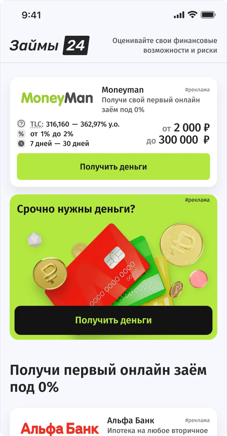
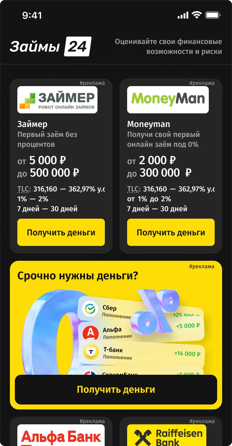
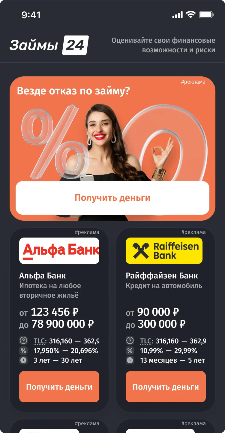
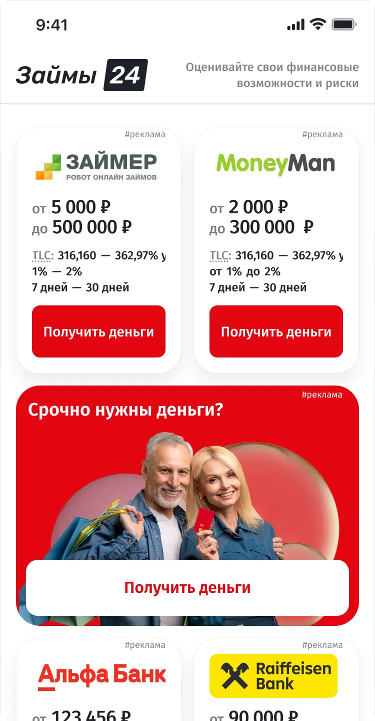
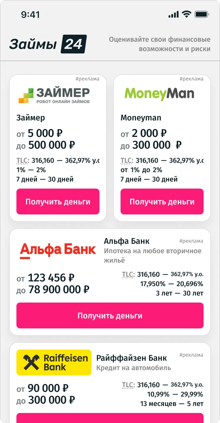
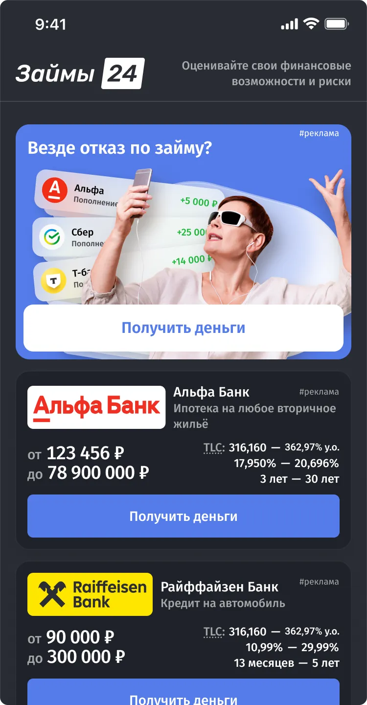
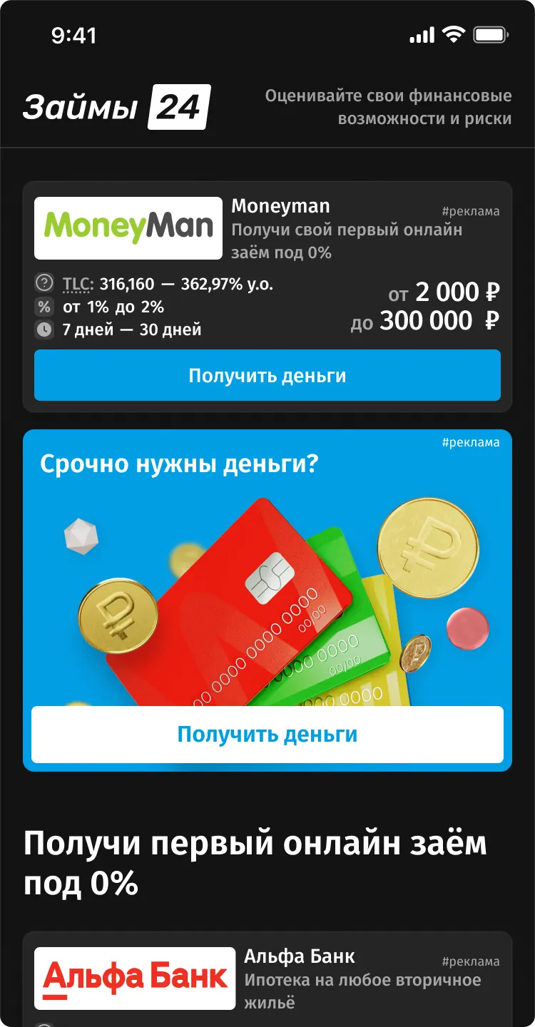
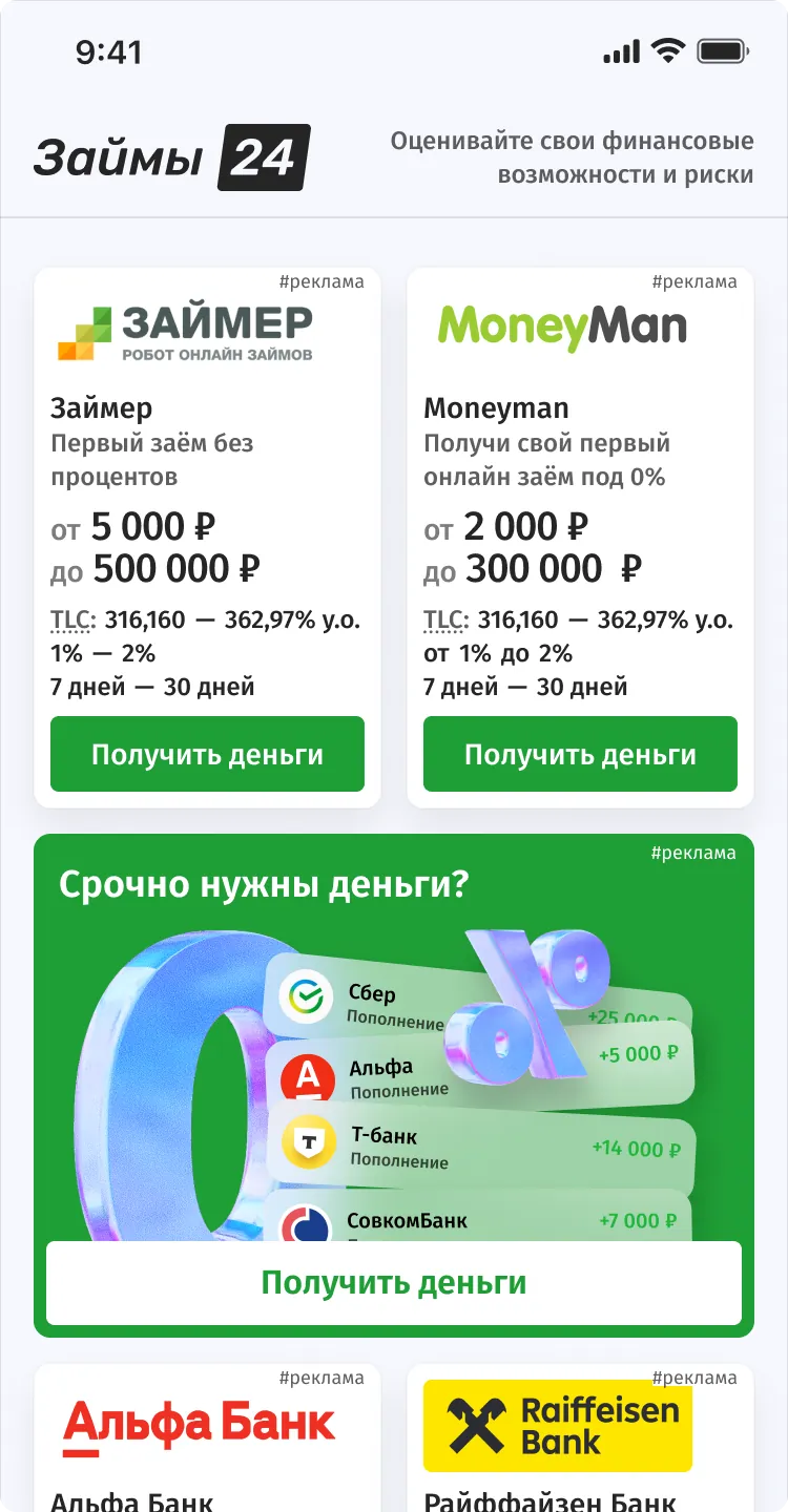
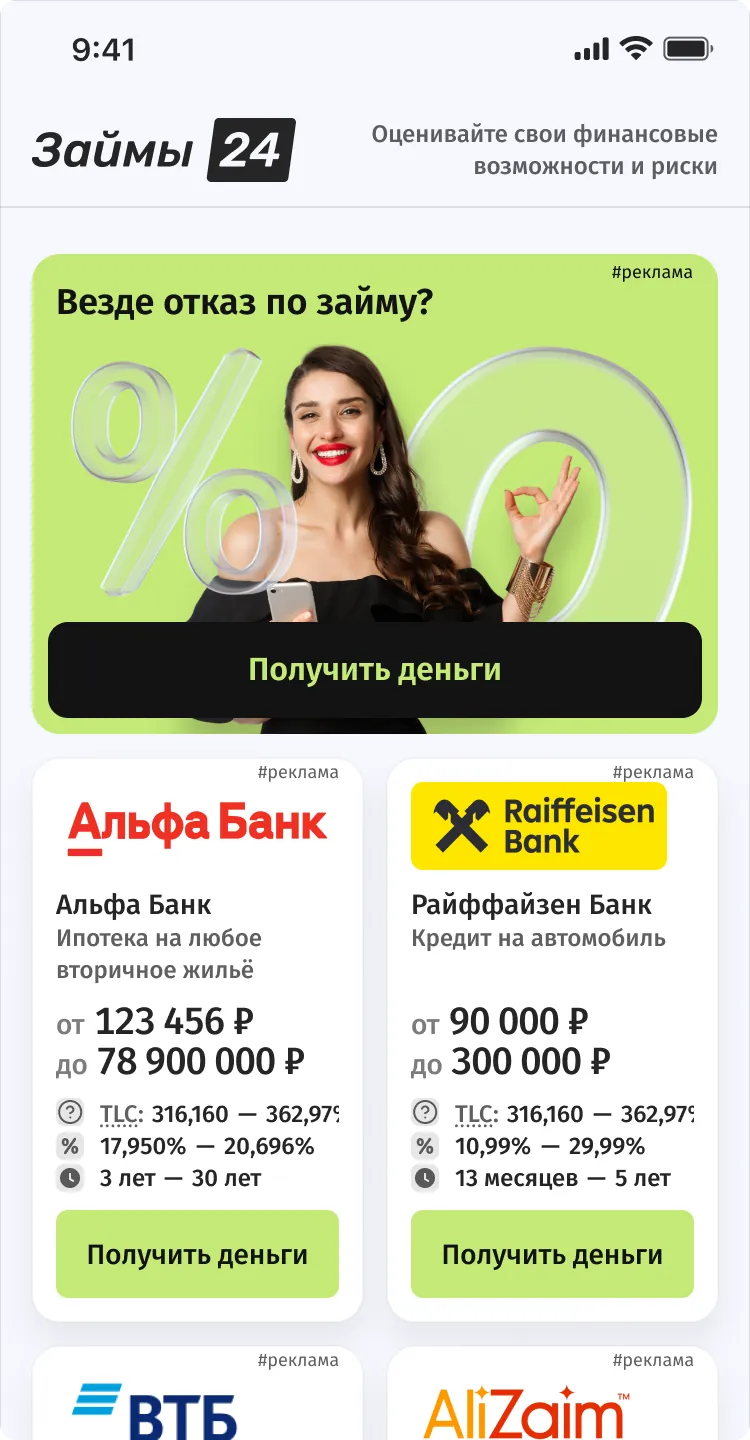
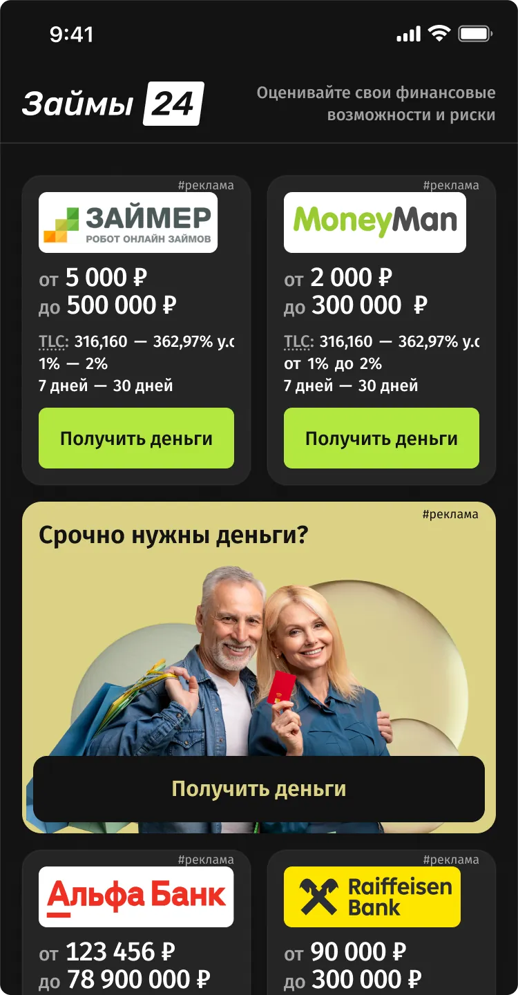
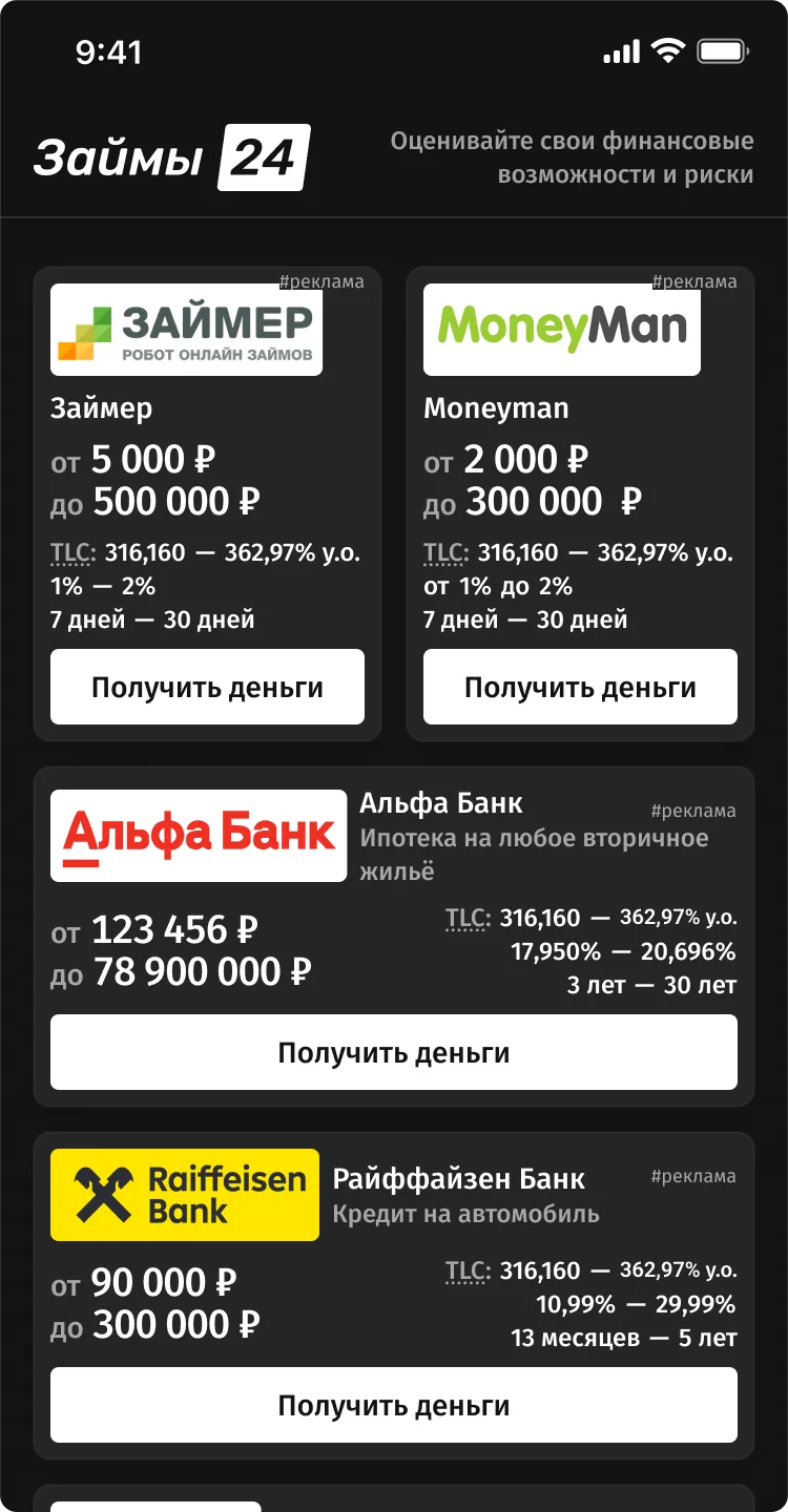
Offer showcase design system
- Role
- Design Systems Engineer
- Scope
- 5 token collections, 17 components
- Project
- Offer showcase builder, Click2Money
- Date
- 2024
- Stack
Result
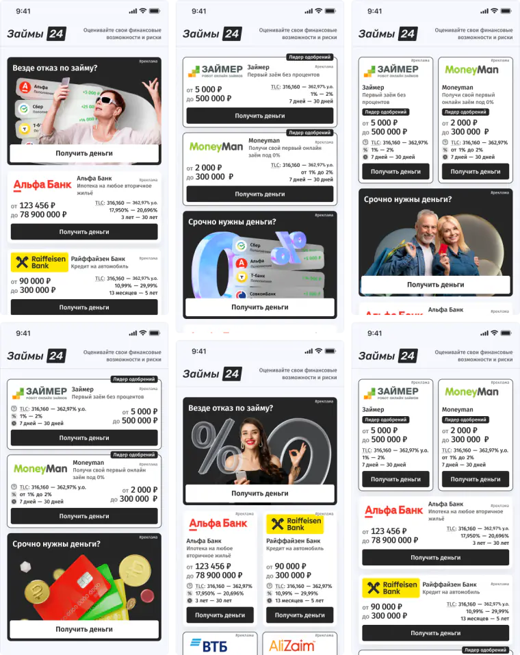
New templates are put together from ready-made parts, and changing a token updates every template at once
Context
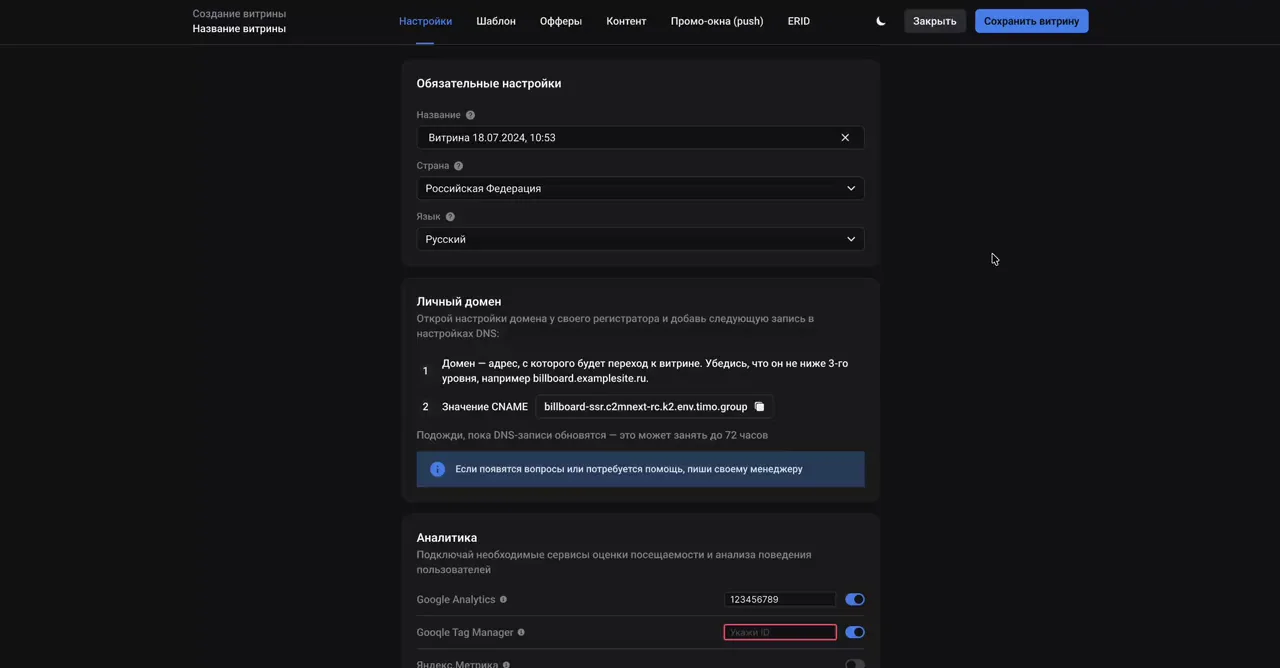
The design system was needed for the showcase templates in the builder. Builder users had to be able to change how a showcase looks on the fly, from card size, radii and spacing to the palette and accent color, so the main challenge was the system’s architecture rather than individual components. We laid the foundation on tokens, and from there the system only needed to grow with new types of cards, headings and banners.
A token is a named style value, like a color or a spacing, that components refer to. A new template is put together from ready-made parts, and changing one token updates every template at once. The tokens are split into five collections (theme, accent, palette, size and breakpoints), and each has modes that switch all of its values at once.
Themes
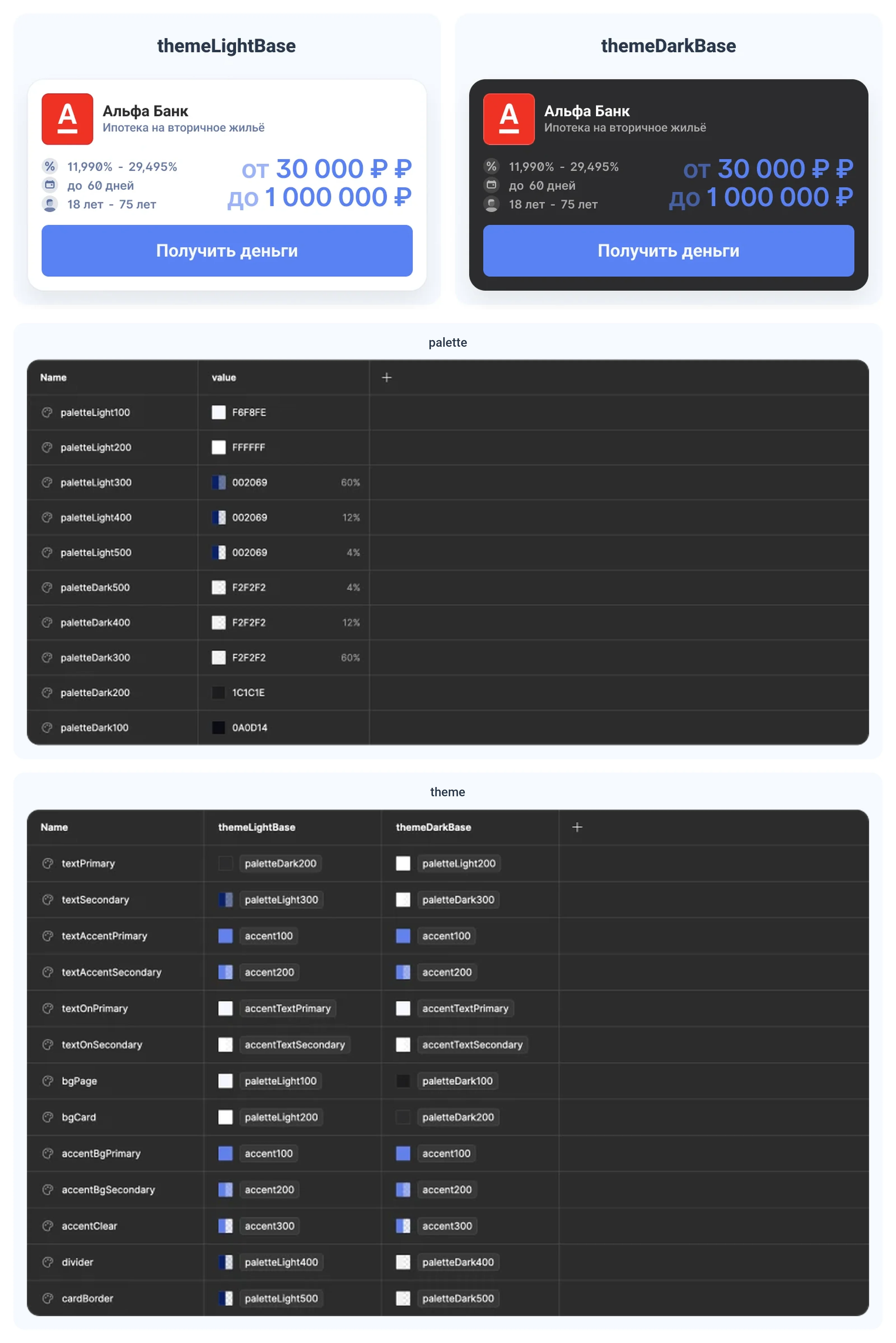
The theme collection defines the final look of a showcase: 13 tokens for text, backgrounds, accents and borders, and none of them stores a color directly, they all refer to the palette or the accent. Light and dark are two modes of the same collection, so switching the theme doesn’t touch a single component.
Accent color
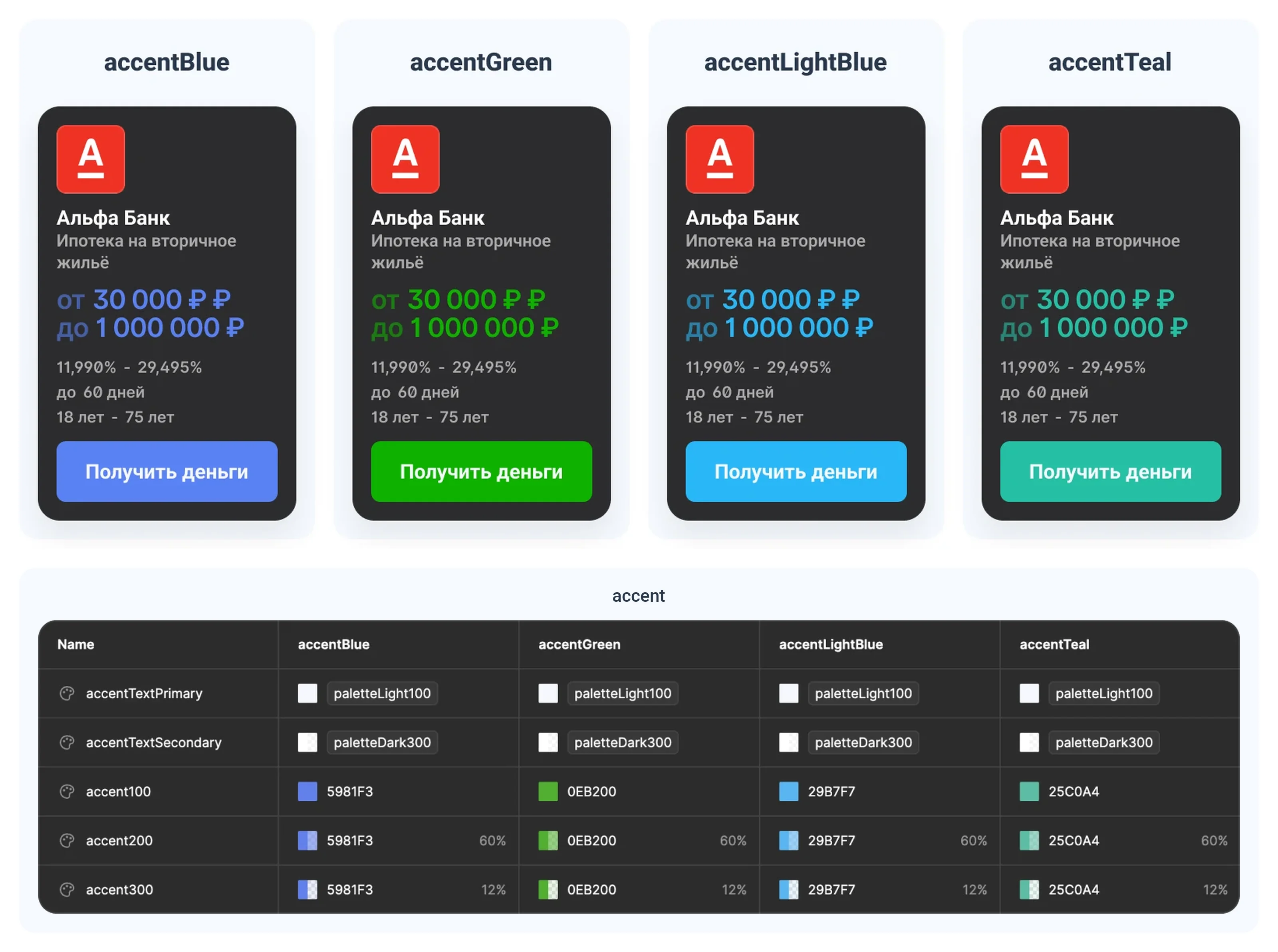
The accent is the color of buttons, highlighted text and backgrounds behind elements. Each of the four accents (blue, green, light blue and teal) is a mode of the accent collection, and inside it is one color in three versions: the base color, 60% for hover and 12% for subtle backgrounds. A new accent is added as one more mode.
Palette
The base colors the theme refers to. Secondary text, dividers and card borders are one color at three opacities: 60, 12 and 4%.
Sizes
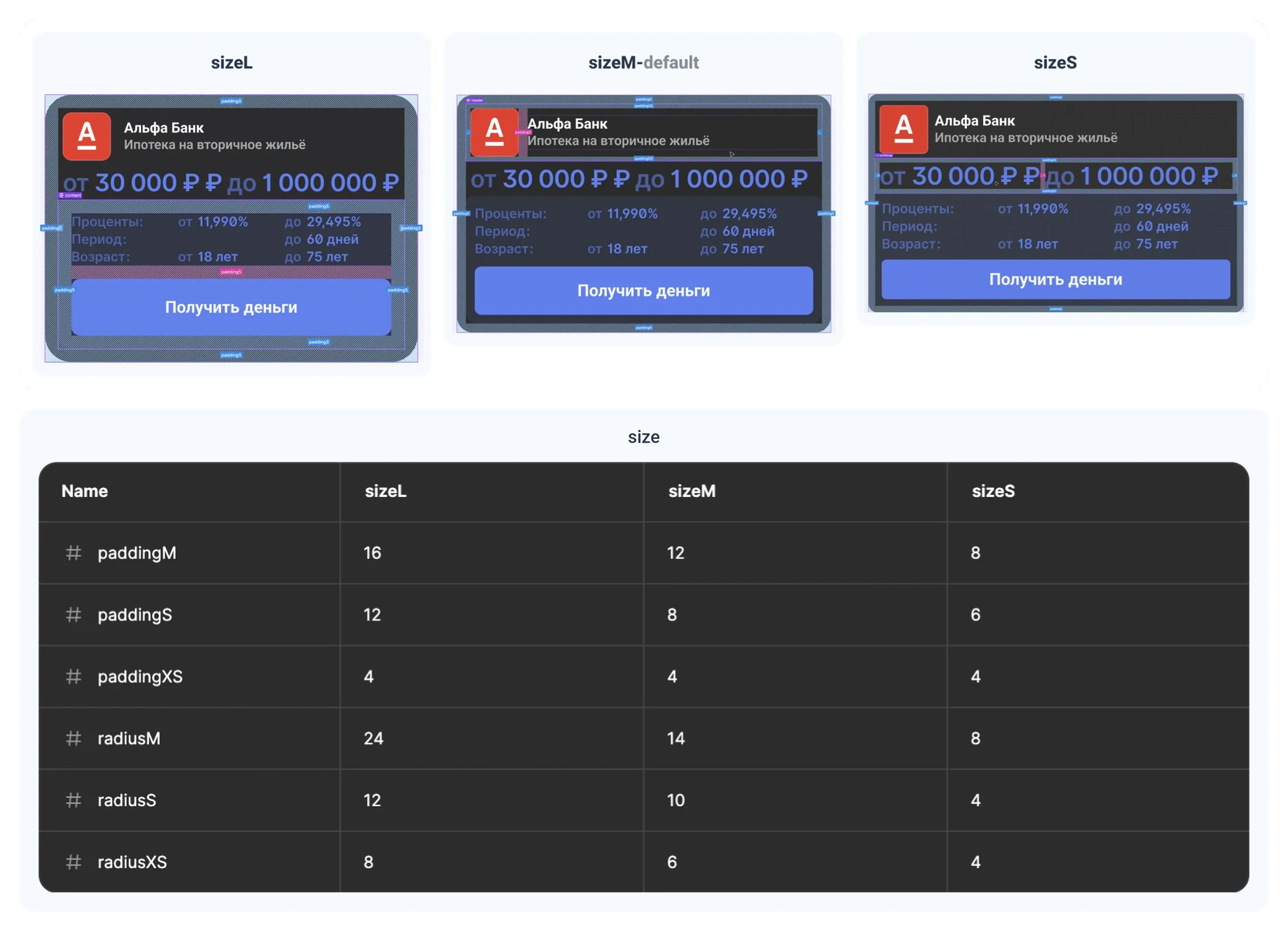
The size collection sets spacing and radii in three modes, L, M and S, with M as the default. Size changes how dense a card is, not how it’s built.
Breakpoints
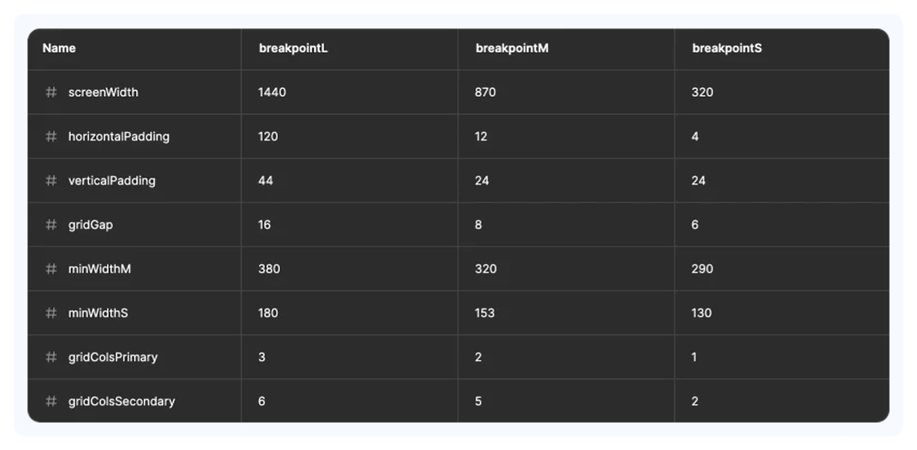
The three breakpoints, 1440, 870 and 320 px, are modes too: switching them changes the margins, the grid gap, the minimum card width and the number of columns, 3, 2 and 1 for wide cards and 6, 5 and 2 for narrow ones. Apart from the tokens, only the h1 heading adapts, and the rest of the layout is the same on every screen.
Components
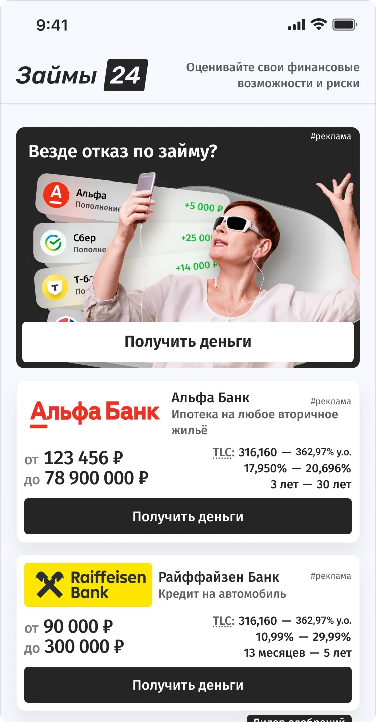
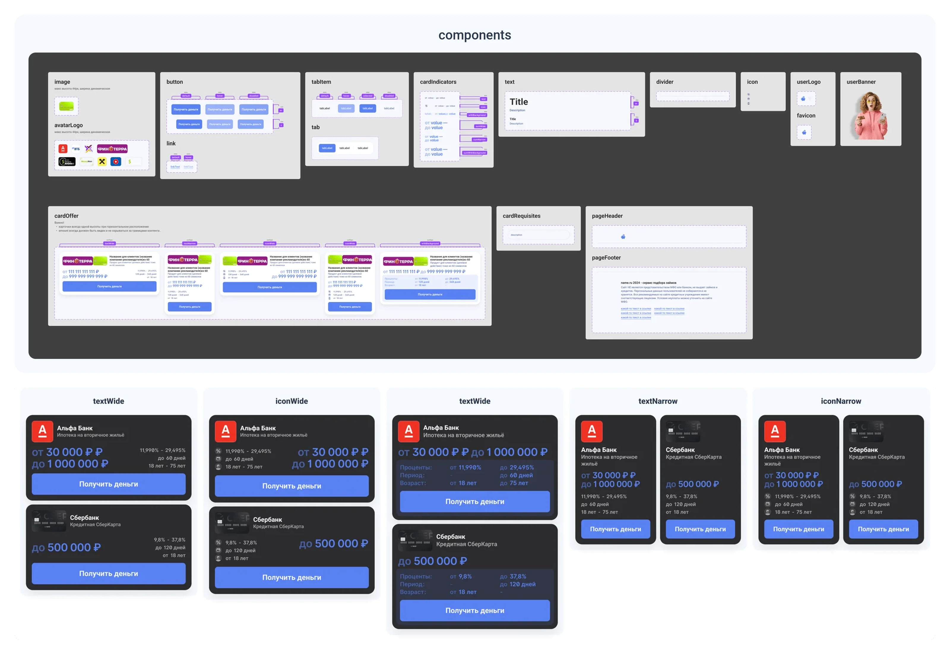
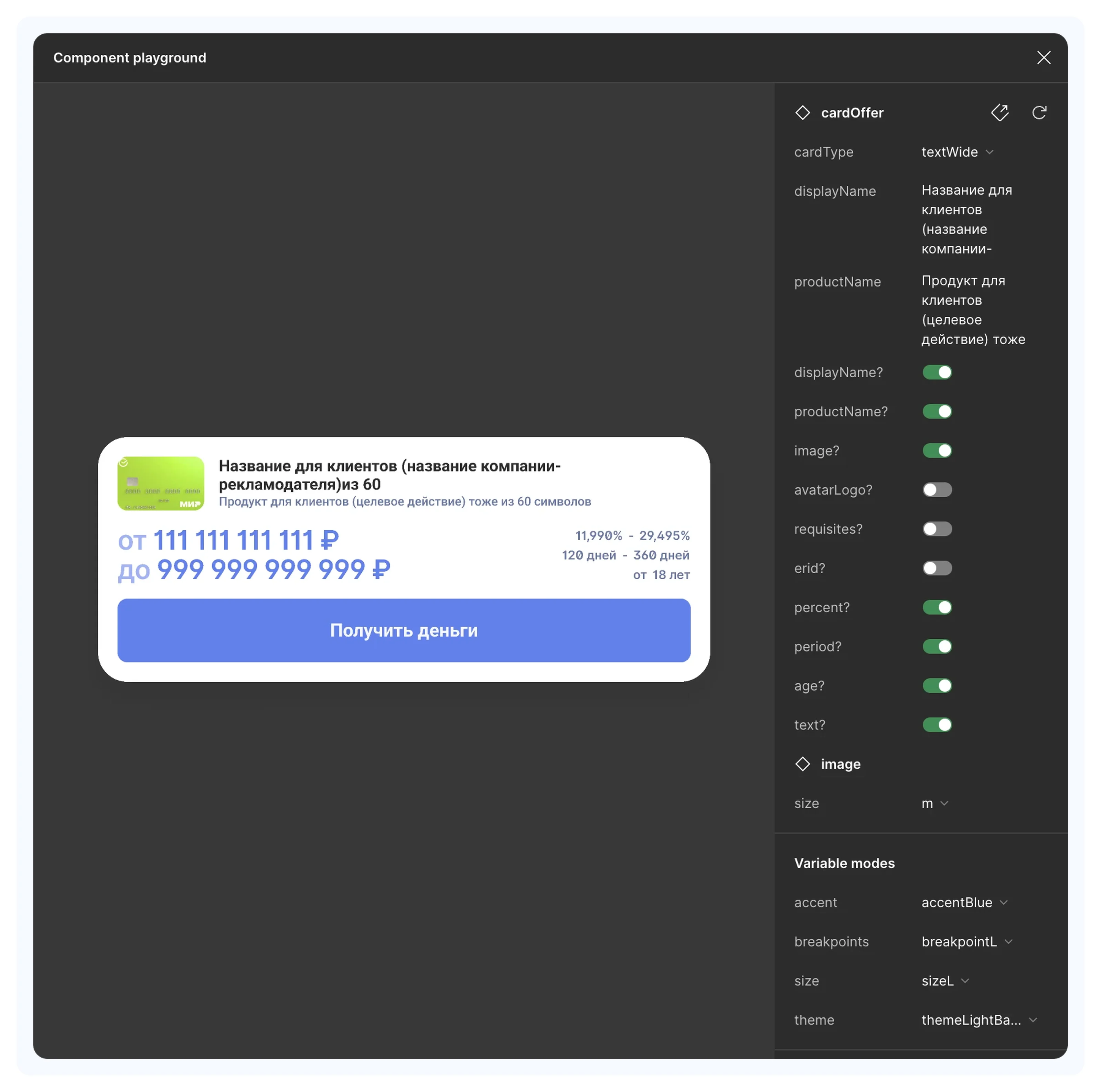
17 components, from a button and a tab to the page header and footer. I also designed banners and modals specifically for the showcases. There’s a single offer card: its fields are turned on with flags, and the theme, accent, size and breakpoint are switched with modes right on the card, so in the playground all of it can be seen on one card.
Card types
Two layouts: wide cards go in a column and narrow ones in a row, and in each the figures are labeled either with text or with icons. That makes four card types for all templates.
Typography
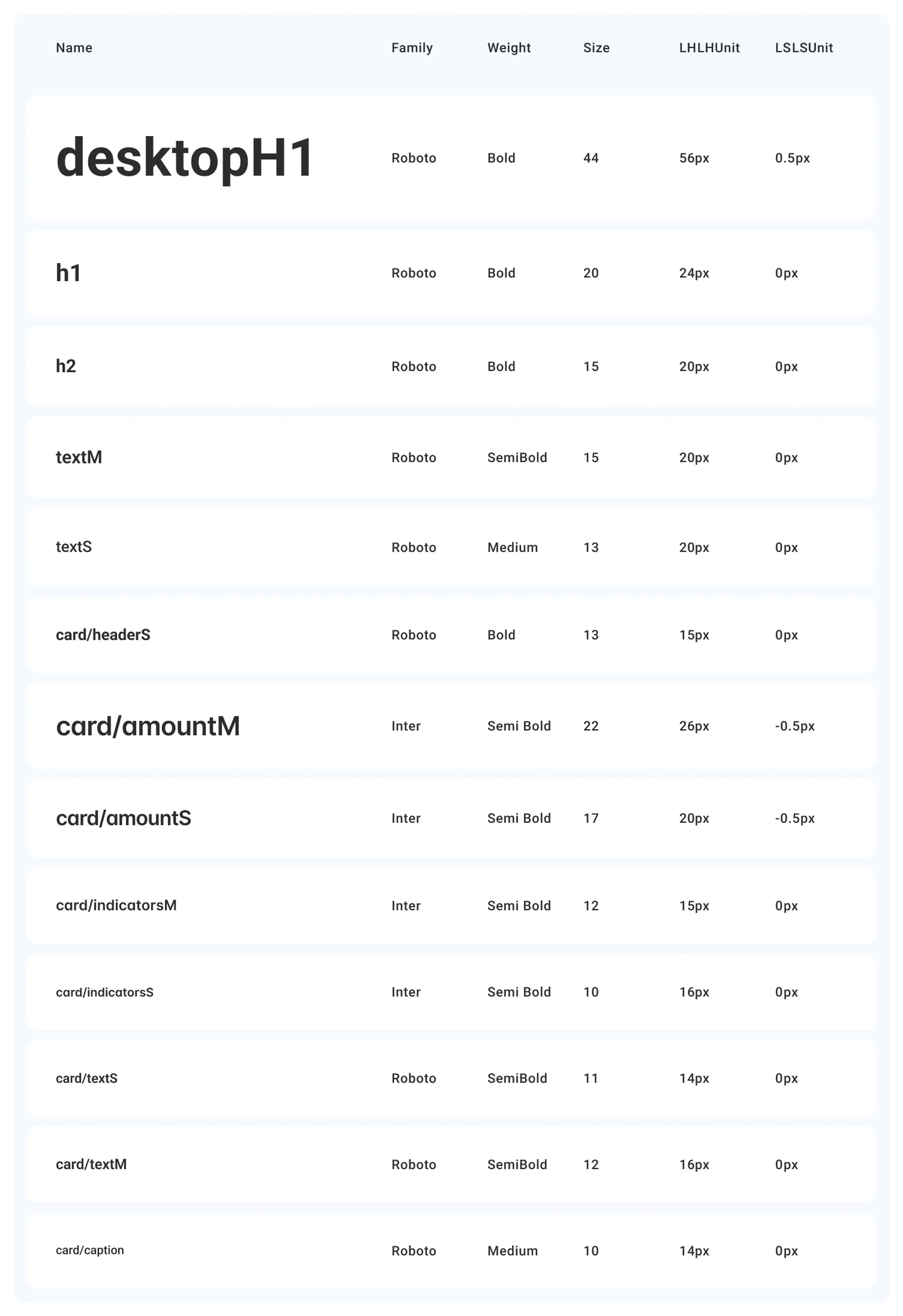
Roboto for text and Inter for amounts and figures: both fonts have plenty of weights and language support, leaving room for showcases in other countries.
An offer card in the light and dark themes, with the palette and the theme tokens in both modes below
One card in four accents, with the accent tokens below: one color at three opacities
A card in three sizes with spacing marked up, with spacing and radii by mode below, px
Token values by breakpoint
Local components and the four card types: textWide, iconWide, textNarrow, iconNarrow
The offer card in the playground: field flags and token modes
Text styles